October 08, 2026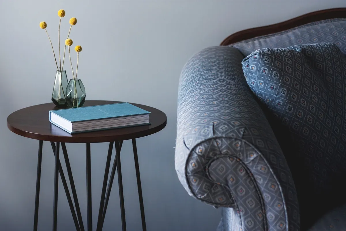
Pattern and colour are the two things most people worry about getting wrong. The fear is fair enough: a scheme can look lovely in a shop and chaotic at home, and it is rarely the pattern's fault. Almost every room that feels off is guilty of one of two things — too many colours with no relationship to each other, or patterns that are all much the same size. Sort those two out and everything else becomes surprisingly forgiving. You do not need an interior designer, a mood board or a big budget. You need one starting point, a little restraint and the willingness to move a cushion twice.
Start With a Palette You Can Actually See
Every scheme needs an anchor. That might be a rug, a painting, a length of fabric, a favourite scarf, even the tiles you cannot change in the bathroom. It does not have to be new or expensive. It has to be something whose colours you genuinely like, because you will be looking at them for years.
Pull three colours from that anchor. One becomes dominant, one secondary, one accent — roughly 60 per cent, 30 per cent and 10 per cent of what you see in the room. That imbalance is why some rooms feel calm and others feel speckled. If everything is evenly weighted, the eye has nowhere to rest.
Check the light before you check the paint chart
Light varies enormously across UK homes, and it changes a colour more than most people expect. North-facing rooms tend to read cool and slightly grey, so warm neutrals — oatmeal, soft clay, mushroom, biscuit — flatter them. South-facing rooms can carry cooler tones: a proper grey, a soft blue, a muted green. East-facing rooms are bright in the morning and dim after lunch; west-facing rooms do the reverse. Before committing to a wall colour, paint two coats onto a sheet of A4 card and move it around the room through the day, with the lamps on as well as off. If it looks right at 8am and at 9pm, it will work.
Let Neutrals Do the Heavy Lifting
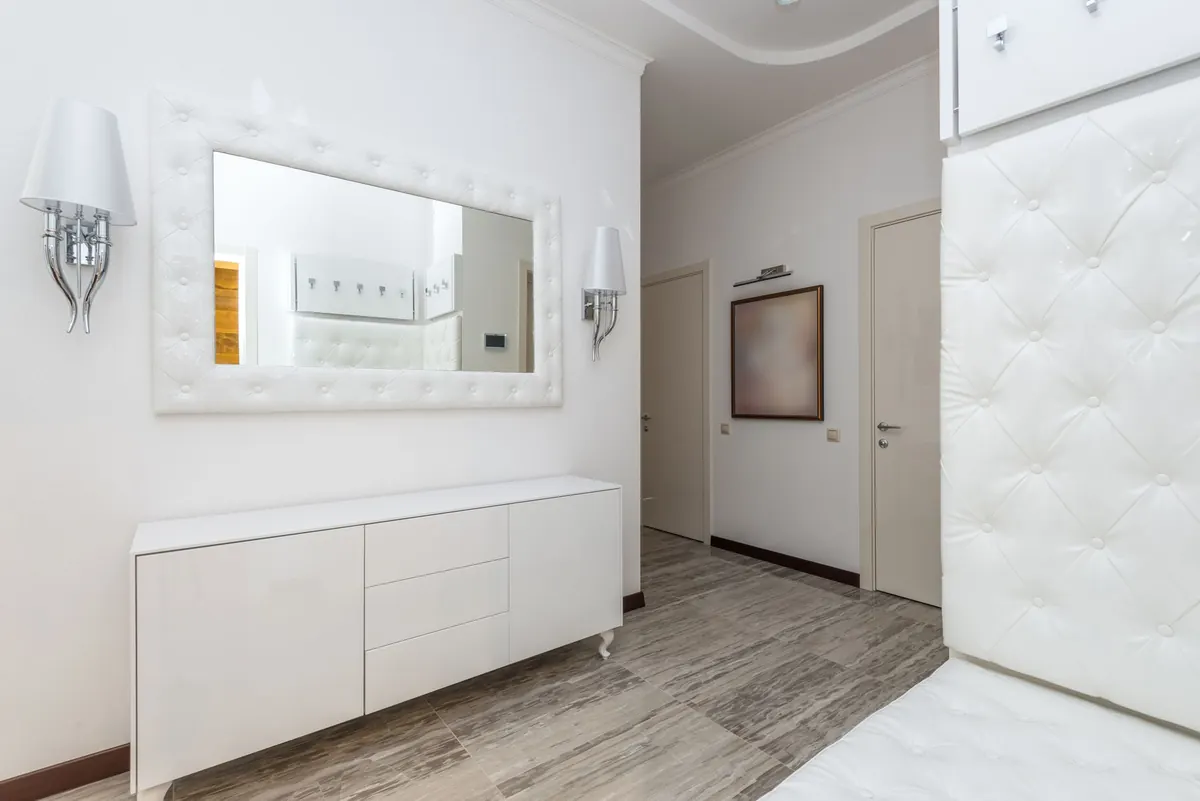
Walls, floors and large upholstery are the expensive, hard-to-change parts of a room, so keep them quiet and put the colour where you can move it. One neutral across the walls, curtains and sofa gives you a settled base; colour then arrives in cushions, throws, a lampshade, artwork and a rug.
Two or three colours is plenty. Three feels generous in a small room. Five is usually clutter, even when each individual colour is lovely. If you want more variety, add a new texture in a colour you already have rather than a new colour altogether — a wool throw beside a linen cushion in the same soft grey, for instance.
Scale Is What Makes Pattern Mixing Work
This is the bit beginners miss. Pattern mixing fails when every pattern is a similar size: three medium florals in one room blur into noise, while one large, one medium and one small read as a deliberate composition.
Think in three scales:
- Large: an open, generous motif — a big leafy print or a wide stripe, usually on curtains, a rug or a headboard.
- Medium: a classic floral, a trellis or a medium check, often on cushions or an armchair.
- Small: a dense, fine print — a ticking stripe, tiny dots, a small geometric — which behaves almost like a texture.
Three patterns is a comfortable number for most rooms. If you want a fourth, make it a stripe in a colour already in the scheme.
Three patterns that share one colour will always look more considered than five patterns that share nothing.
Give every pattern one shared colour
Any two patterns will sit together happily if they share at least one colour. A blue-and-white ticking stripe, a larger floral containing that same blue, and a small navy geometric are three very different designs tied together by a single thread. Remove that shared colour and the same three cushions look like a jumble sale.
Pairings that rarely disappoint
- Florals with stripes — the oldest trick in British decorating, and still the most reliable.
- Geometrics with organic prints, so order meets leafiness.
- Checks with small dots or a fine stripe.
- One bold pattern with two quiet ones, rather than three loud ones competing.
- Different motifs in the same two colours, which is the calmest form of pattern mixing there is.
Texture Is the Pattern You Cannot See
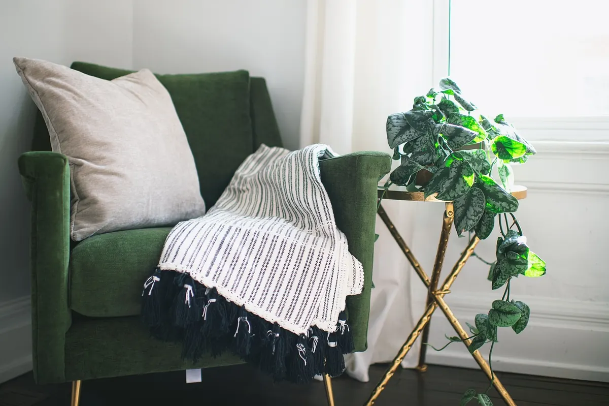
Colour and print get the attention; texture keeps the volume down. A room with six patterns and nothing tactile can feel flat and oddly cold, while a room with two patterns and plenty of texture feels rich. Layer wool, linen, cotton, velvet, jute, bouclé, rattan, aged wood and a little brass or black metal.
A quick test: photograph your arrangement and look at it in black and white. If everything turns into the same mid-grey, you have colour but no contrast in texture. Add something nubby (a bouclé cushion), something smooth (velvet), something rough (jute or a woven basket) and something with a gentle sheen.
A Simple Order of Work
Working in this order saves a lot of buying and returning:
- Choose the anchor — a rug, a piece of art or a fabric you already own.
- Take three colours from it and decide which one dominates.
- Pick one neutral for walls, curtains and the largest piece of furniture.
- Choose three patterns at three different scales.
- Check that each pattern shares a colour with at least one of the others.
- Add texture in the same palette: wool, linen, velvet, jute, wood.
- Step back, take a photo, and remove one thing. Most schemes improve with less.
Common Mistakes and Quick Fixes
- Everything came in a set. Matching cushions, curtains and bedding from one range look flat. Break the set with an unrelated stripe or a plain textured piece.
- Too many accent colours. Reduce to one accent and repeat it three times around the room.
- All patterns the same size. Swap one medium print for a large one, or move it to another room.
- The rug is too small. In a sitting room, a rug should reach under the front legs of the sofa and chairs. A small rug makes good furniture look like it is floating.
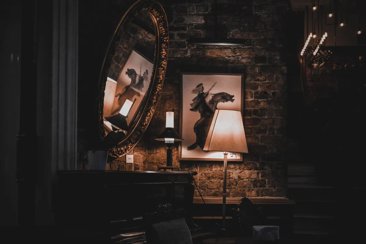
- Harsh overhead lighting. Two or three lamps at different heights soften colour considerably and make fabric look better.
Start With One Corner
Pick the corner you look at most — beside the sofa, or the end of the bed — and build the scheme there first. Keep the receipts. Live with it for a week, moving cushions, a throw, a lamp. Once the colours and scales feel right in one place, you have a kit of parts that will work elsewhere in the house: the same three colours, the same three scales, a different arrangement. Very few rooms are finished in one go. A room that looks considered is usually one that has been quietly adjusted for a while by someone who stopped worrying about everything matching.
Photo: StockSnap / Pixabay